UI is hard, and other Typical Work Stories
Recently I’ve seen a mention that game engine programming is considered a mysterious, elite, and highly demanding type of work. So let me write up what often actually happens in day to day work. Also about how in many types of tasks, doing the UI is often the hardest one :)
Request: separate texture UV wrapping modes
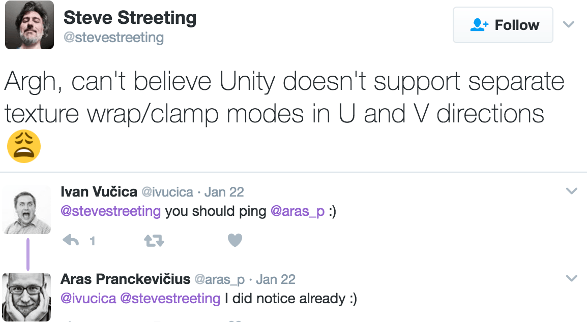 I saw “could we have separate wrap modes for texture U and V axes?” being requested on the internets.
This is not new; we had actually discussed this same thing internally just a few weeks before.
Up until now, in Unity you could only specify one texture coordinate wrapping mode that would apply to both (or in volume texture case, all three) axes.
All the graphics APIs and and GPUs I’ve seen do support separate UV(W) wrap modes, and while it’s not a common use case, there are valid cases where that is useful to have. For example, when using Lat-Long environment maps for reflection probes, it is useful to have Clamp on vertical texture coordinate, but Repeat on the horizontal coordinate (why use lat-long environment maps? because some platforms don’t support cubemap arrays, and yeah I’m looking at you mobile platforms).
So I thought I’d do it as part of Mondays are for Mandatory Fun(tm) thing we have:
How hard could this possibly be?
The change itself is trivial. Instead of having one wrap mode in a sampler descriptor" we need to have three, and set them up to the graphics API acoordingly. Actual platform specific change looks something like this (Metal here, but very similar for any other API). Somewhere where the sampler state is created or set up:
“Oh, but Unity supports, I don’t know, three million graphics APIs? That’s gonna be hard to do?” – turns out, not really. At the time of writing, I had to add code to 11 “platform API abstraction” implementations. Eleven is more than one or two, but doing all that was trivial enough. Even without having compilers/SDKs for at least half of them :)
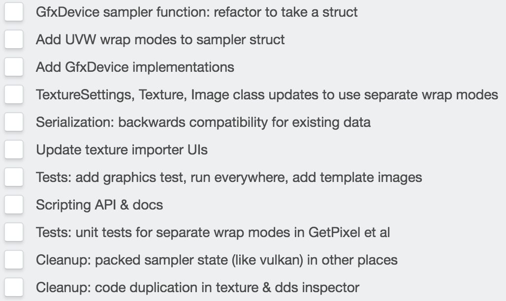 Real amount of work starts to appear once you try to write down what are “all the things” that need to be done.
The “graphics API” bit is just one entry there!
Before doing a task like this, I look for whether that particular area is in a need of some small cleanup or refactor. In this case it was; we were passing all sampler state as separate arguments into platform abstraction functions, instead of something like a “sampler descriptor struct”. It was already cumbersome, and adding separate wrapping modes would not make it better. So first item on the list becomes, “refactor that”.
And then when doing actual changes, I’d keep on noticing “well this should be cleaned up” type of code too, and write that down to the end of the list. None of that is critical for the task at hand, but codebase cleanup does not happen by itself otherwise.
Most of the items on the list are easy enough though. Except… yeah, UI.
User Interface
Ok, so how do you show UI in texture settings for separate wrapping modes?
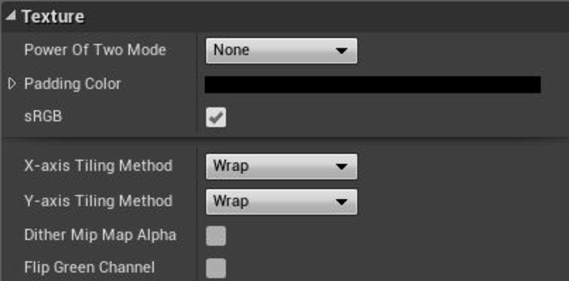 I looked at what others do, and for example UE4 just shows two dropdowns. This is trivial
to implement, but did not feel “quite right”. Afterall, the expected 95% use case is that you’d want
to use the same wrapping mode on all axes. Doing this would get you the feature/flexibility (yay!),
but a fairly rarely used one that costs an extra row of setting controls, no matter whether you need it or not.
It should be possible to do better.
Try 1: extend wrap mode popup with more options
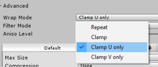
Today we only support Repeat and Clamp wrapping modes, and absolute majority of textures are non-volume textures. Which means extending to separate UV wrapping modes only needs to add two more entries into a single popup:
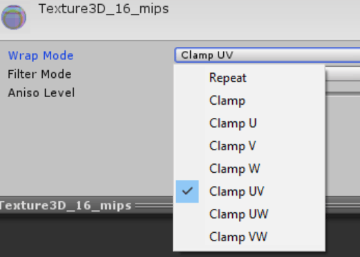 That is not too bad. For volume textures, there are three axes to worry about, so the popup becomes a choice of
8 possible options. This is more confusing, but maybe we can sweep it under a “hey this is a super rare case” rug.
A slightly bigger worry is that people are also asking for other coordinate wrapping modes that we have not exposed before (“border” and “mirror”). If/when we add them, the single popup would not be a good solution. The number of entries in in would become too large to be useful.
Try 2: per-axis popups, linked by default
 You know that “these fields are linked” widget from image editors?
I thought maybe let’s do that; show one popup per-axis, but by default have them linked together. Here’s how it looks like (using “lock” icon to mean “linked”, because no one painted a proper icon yet):

 And then it can be unlinked to select different wrapping modes. For volume textures, it would display three
popups, but otherwise function the same.
This almost works fine. The downsides are:
- Still additional visual noise in the settings even if you don’t use the feature, and
- In the image editors, “linked” is mostly used for numeric input fields; linking dropdown controls together is not a familiar UI pattern.
Try 3: one popup with “Per-Axis” choice
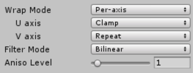
Here’s another idea: keep one popup by default, but instead of it having just [Repeat, Clamp] options,
make them [Repeat, Clamp, Per-axis]. When per-axis is selected, that rolls out two more popups underneath
(or three more, for volume textures):
This one actually feels nice. Yay! And only took three attempts to get right.
Oh, and then some more fumbling around to nicely handle various cases of multiple textures being selected, them all possibly having different settings set.
Doing all that UI related work took me about twice as long as doing everything else combined (and that includes “changes to eleven graphics APIs”). Now of course, I’m not a UI programmer, but still. UI is hard.
That’s it!
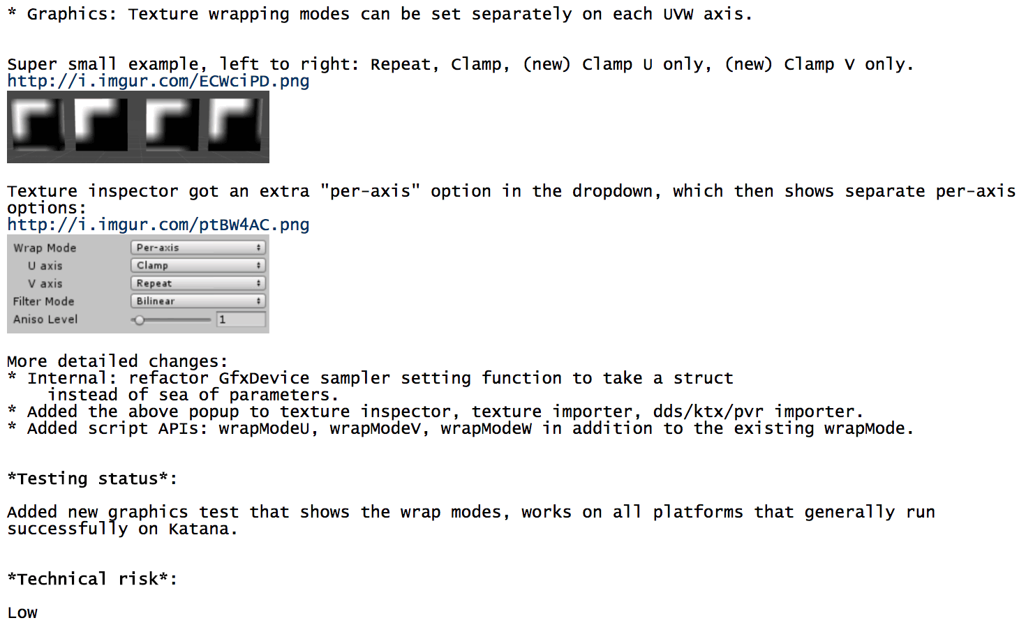 So yeah. A super small feature, that ended up probably two full days of work. Majority of that: trying to decide
how exactly to present two popup controls. Who would have thunk, eh.
Otherwise, pretty much trivial steps to get there. However this does end up with about a hundred files being changed.
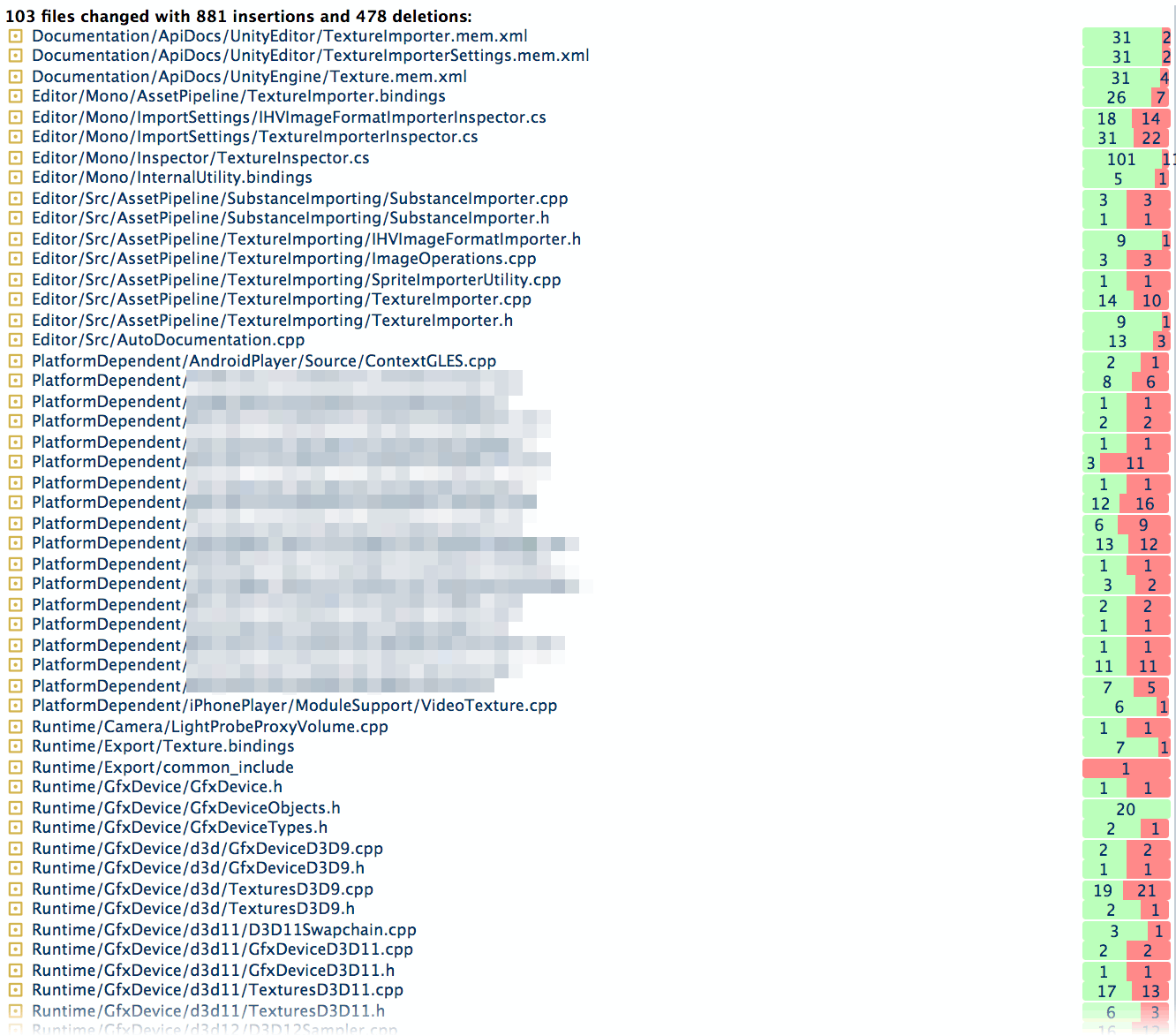 …and that is how “mysterious engine programming” looks like :) Now of course there is plenty
of really challenging, “cutting edge knowledge required” type of work, where juggling chainsaws
would probably look easy in comparison. But, plenty of “nothing special, just work” type of items too.
Separate texture UV wrapping modes might be coming to a nearby Unity version soon-ish. Thanks to Alexey, Lukas, Shawn, Vlad for UI discussions & suggestions.


