Gradients in linear space aren't better
People smarter than me have already said it (Bart Wronski on twitter), but here’s my take in a blog post form too. (blog posts? is this 2005, grandpa?!)
When you want “a gradient”, interpolating colors directly in sRGB space does have a lot of situations where “it looks wrong”. However, interpolating them in “linear sRGB” is not necessarily better!
Background
In late 2020 Björn Ottosson designed “Oklab” color space for gradients and other perceptual image operations. I read about it, mentally filed under a “interesting, I should play around with it later” section, and kinda forgot about it.
Come October 2021, and Photoshop version 2022 was announced, including an “Improved Gradient tool”. One of the new modes, called “Perceptual”, is actually using Oklab math underneath.
Looks like CSS (“Color 4”) will be getting Oklab color space soon.
I was like, hmm, maybe I should look at this again.
sRGB vs Linear
Now - color spaces, encoding, display and transformations are a huge subject. Most people who are not into all that jazz, have a very casual understanding of it. Including myself. My understanding is two points:
- Majority of images are in sRGB color space, and stored using sRGB encoding. Storage is primarily for precision / compression purposes – it’s “quite enough” to have 8 bits/channel for regular colors, and precision across the visible colors is okay-ish.
- Lighting math should be done with “linear” color values, since we’re basically counting photons, and they add up linearly.
Around year 2010 or so, there was a big push in real-time rendering industry to move all lighting calculations into a “proper” linear space. This kind-of coincided with overall push to “physically based rendering”, which tried to undo various hacks done in many decades prior, and to have a “more correct” approach to rendering. All good.
However, I think that, in many bystander minds, has led to a “sRGB bad, Linear good” mental picture.
Which is the correct model when you’re thinking about calculating illumination or other areas where physical quantities of countable things are added up. “I want to go from color A to color B in a way that looks aesthetically pleasing” is not one of them though!
Gradients in Unity
While playing around with Oklab, I found things about gradients in Unity that I had no idea about!
Turns out, today in Unity you can have gradients either in sRGB or in Linear space, and this is independent on the “color space” project setting. The math being them is “just a lerp” in both cases of course, but it’s up to the system that uses the gradients to decide how they are interpreted.
Long story short, the particle systems (a.k.a. “shuriken”) assume gradient colors are specified in sRGB, and blended as sRGB; whereas the visual effect graph specifies colors as linear values, and blends them as such.
As I’ll show below, neither choice is strictly “better” than the other one!
Random examples of sRGB, Linear and Oklab gradients
All the images below have four rows of colors:
- Blend in sRGB, as used by a particle system in Unity.
- Blend in Oklab, used on the same particle system.
- Blend in Linear, as used by a visual effect graph in Unity.
- Blend in Oklab, used on the same visual effect graph.
Each color row is made up by a lot of opaque quads (i.e. separate particles), that’s why they are not
all neatly regular:

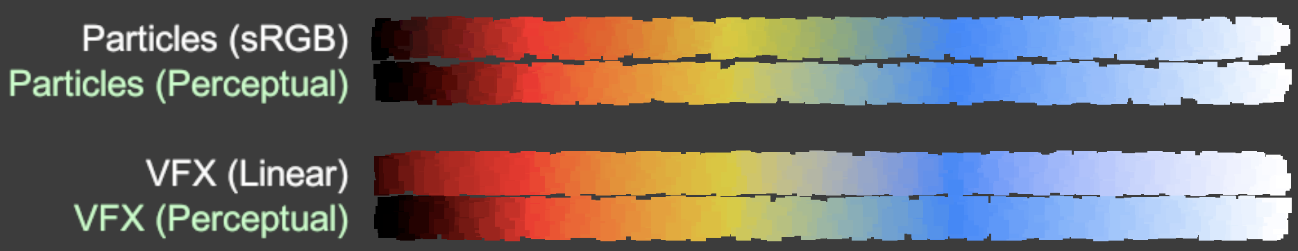
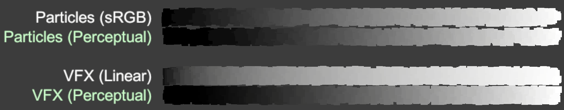 Black-to-white is “too bright” in Linear.
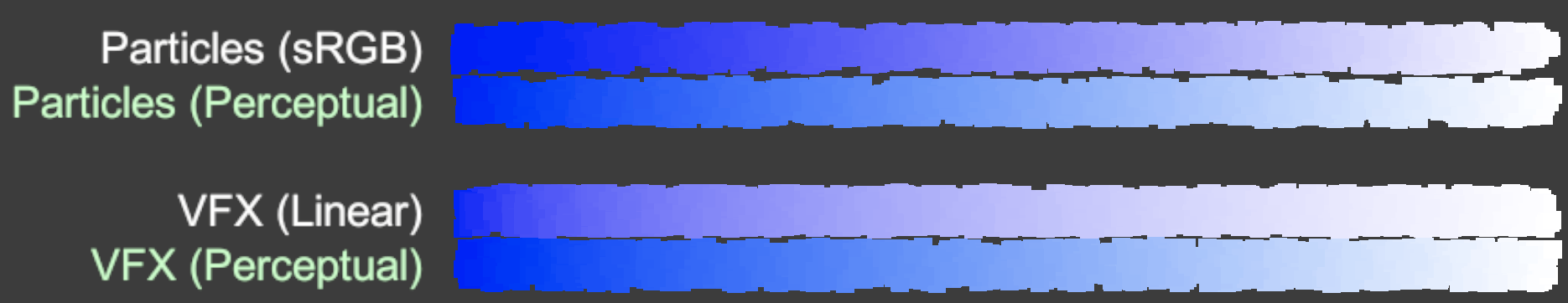 Blue-to-white adds a magenta-ish tint in the middle, and also “too bright” in Linear.
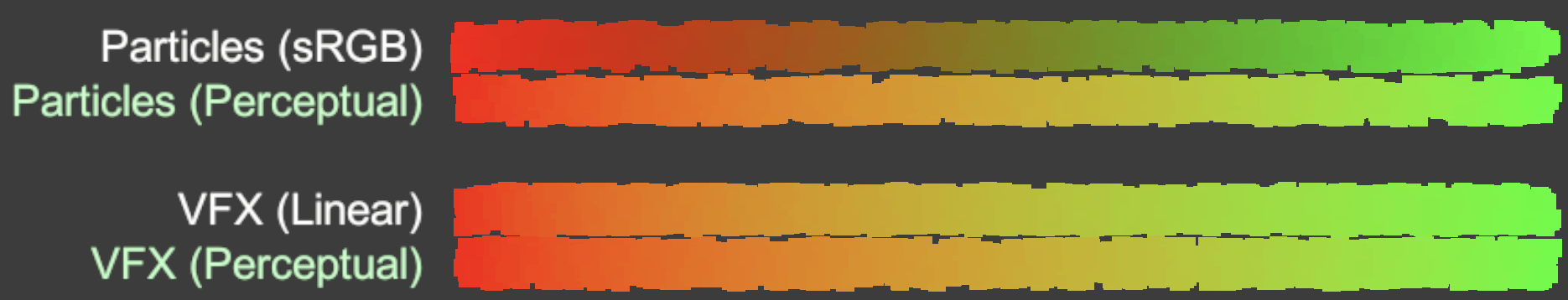 Red-to-green is “too dark & muddy” in sRGB. Looks much better in Linear, but if you compare it with
Oklab, you can see that in Linear, it feels like the “red” part is much smaller than the “green” part.
Red-to-green is “too dark & muddy” in sRGB. Looks much better in Linear, but if you compare it with
Oklab, you can see that in Linear, it feels like the “red” part is much smaller than the “green” part.
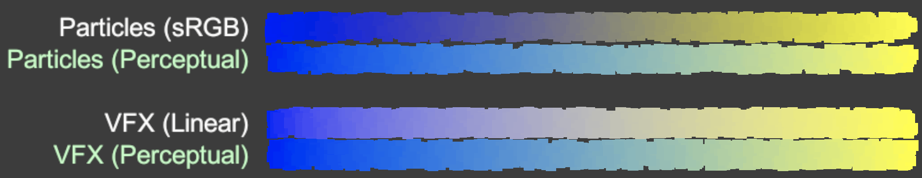 Blue-to-yellow is too dark in sRGB, too bright in Linear, and in both cases adds a magenta-ish tint.
The blue part feels too narrow in Linear too.
Blue-to-yellow is too dark in sRGB, too bright in Linear, and in both cases adds a magenta-ish tint.
The blue part feels too narrow in Linear too.
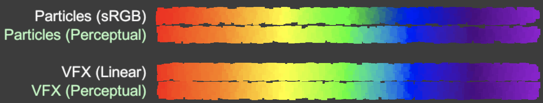 Rainbow gradient using standard “VIBGYOR” color values is missing the cyan section in sRGB.
 Black-red-yellow-blue-white adds magenta tint around blue in Linear, and the black part goes too bright too soon.
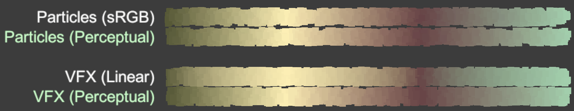 Random set of “muddy” colors - in Linear, yellow section is too wide & bright, and brown section is too narrow.
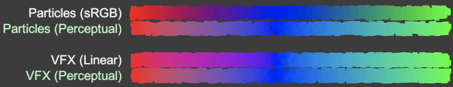 Red-blue-green goes through too dark magenta/cyan in sRGB, and too bright magenta/cyan in Linear.
Further reading
I don’t actually know anything about color science. If the examples above piqued your interest, reading material from people in the know might be useful. For example:
- “A perceptual color space for image processing” by Björn Ottosson (2020 Dec) is the original Oklab blog post.
- “An interactive review of Oklab” by Raph Levien (2021 Jan) has a lot of details, and an interactive gradient tool with lots of color spaces.
- “Notes on OKLab” by Chris Lilley (2021 Feb) has even more color sciencey details, and also a related “Better than Lab? Gamut reduction CIE Lab & OKLab” video (2021 Sep).
That’s it!