Visuals in some great games
I was thinking about visuals of the best games I’ve recently played. Now, I’m not a PC/console gamer, and I am somewhat biased towards playing Unity-made games. So almost all these examples will be iPad & Unity games, however even taking my bias into account I think they are amazing games.
So here’s some list (Unity games):

Monument Valley by ustwo.
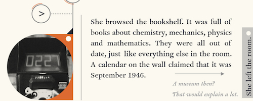
DEVICE 6 by Simogo.
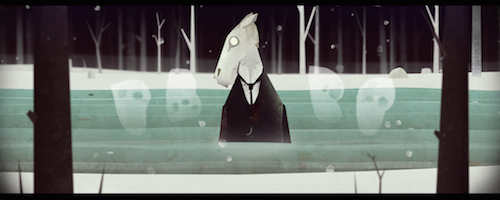
Year Walk by Simogo (also for PC).
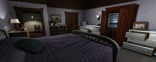
Gone Home by The Fullbright Company.
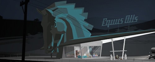
Kentucky Route Zero by Cardboard Computer.
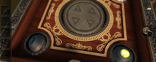
The Room by Fireproof Games.
And just to make it slightly less biased, some non-Unity games:
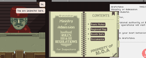
Papers, Please by Lucas Pope.
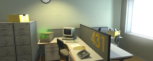
The Stanley Parable by Galactic Cafe.
Now for the strange part. At work I’m working on physically based shading and things now, but take a look at the games above. Five out of eight are not “realistic looking” games at all! Lights, shadows, BRDFs, energy conservation and linear colors spaces don’t apply at all to a game like DEVICE 6 or Papers, Please.
But that’s okay. I’m happy that Unity is flexible enough to allow these games, and we’ll certainly keep it that way. I was looking at our game reel from GDC 2014 recently, and my reaction was “whoa, they all look different!”. Which is really, really good.