Another Vista review (after 6 months of usage)
Ok, I don’t exactly like Windows Vista. But I just spent 6 months using Vista as my primary OS at work… because everyone else was using XP, and someone had to make sure everything works on Vista as well. So it was me.
In summary, Vista is not that bad.
Once you get used to changes in Explorer, different skin and so on - it’s actually usable. I think they have made some real improvements in the underlying technology, too bad they managed to “compensate” for all of that by inconsistencies and lack of polish in user interface.
At this point it’s minor quirks in UI that annoy me, but apart from that, Vista is okay. Look:
![]()
Who implemented blending of icon overlays and do they still have a job? No sir, that shield icon is not properly blended here!

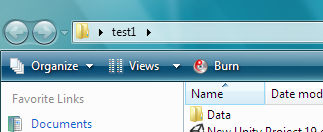
Who thought it’s a good idea to make the Burn icon bright red? In 6 months, I never used it. Why is it the brightest thing in the whole Explorer window?

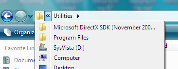
Try going one folder up without resorting to this drop down menu. Utilities is the current folder here. And no, there’s no keyboard shortcut for “go up” either (there was in XP, which was perfect).

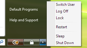
And of course, the awesome shutdown menu. The two buttons - never used them. What I always use is “Shut Down” from the menu. And let’s not even talk about all the choices in the menu (no, more choices is not always better).
So yeah. It’s not stellar, it has tons of small annoyances (and some large ones - try developing web plugins with UAC on…), but it’s usable. I might have gotten used to it by now, actually.